#5 - Maserati Boomerang concept car by Giorgetto Giugiaro by Charlie Sutton

What is it? Who made it?
It's a concept car, designed by Giorgetto Giugiaro in 1971. A version became drivable the following year, and still putters around the Riveria.

How is it made?
Giugiaro famously said it was “drawn almost exclusively with a ruler”, and pure lines are everywhere in this incredible wedge shape.  A straight path traces from nose to roof, crossing the perilously shallow windshield rake of 13 degrees.  The sunroof maintains flow until meeting a mid-mounted engine. From any angle, the profile is magnetic. It has inspired everything from the Lotus Esprit that followed, to squadrons of Italian marque supercars - and even the Delorean DMC-12.


Giugiaro designs today, as as he did then -

"I still use the same process based on mathematical master models using a draughtsman’s board. I do the colourful drawings afterwards, not before. The sketch is the starting point from which a 3D model will be designed. All the steps are there in the drawing. Once the final decisions are made on paper then the model is built"
Q&A at Caredesignnews.com
Dimensional drawing of the Boomerang found Pinterest via carbodydesign.com 

Dimensional drawing of the Boomerang found Pinterest via carbodydesign.com 

Why did I pin this?
I have real affection for the materials and forms of aerospace in the 60s and 70s. Raw steel, delta wings, slender profiles and the optimism of supersonic design. The Boomerang feels ready to lift off, some earth-bound ancestor to the Buck Rodgers Thunderfighter or the Star Wars Snowspeeder that I coveted as a child.

There are also plenty of small touches to linger on.  At rest - the geometric wheel hubs could be from a Frank Lloyd Right Ennis House driveway.  At speed they re-enforce the angular nature of the bodywork.  And still worthy of a magazine cover over forty years later.

Louis Vuitton Winter Campaign

Louis Vuitton Winter Campaign

And then there's the steering column - both brilliant and bonkers.  The instrument cluster is inside the wheel, which apparently has safety benefits in the event of crash, but I'll just leave it there as a monument to pilot dreams.

What did I learn?
To be honest, more about the man than the machine.  Guigiaro's method is tested, strong - and simple. 

"Have plenty of goodwill and be knowledgeable about all the technical possibilities to fulfil a dream. Because dreams must be possible." 

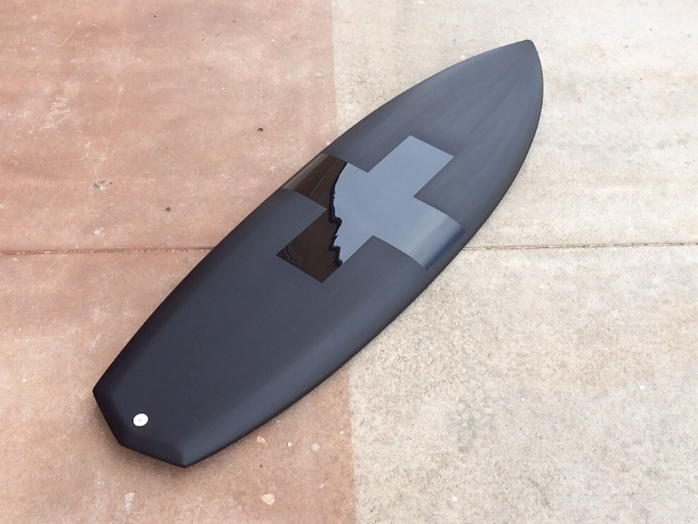
#4 - 5'10" DOOM Stub Board by Album Surfboards by Charlie Sutton

What is it? Who Made it?
It's a surfboard.  I'm not sure who shaped this one, but I'll hazard a guess that it's Matt Parker.

How was it made?
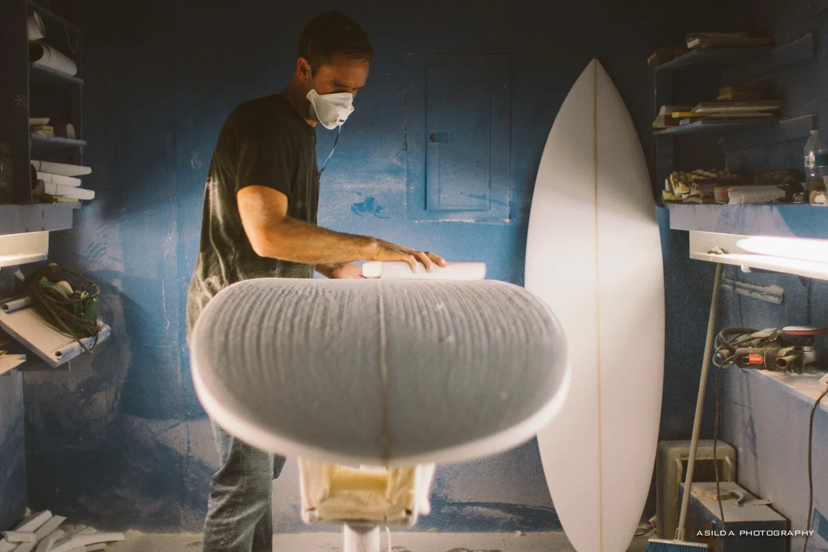
Most boards start as a polyurethane 'blank'.  This is loosely surf-board shaped to begin with, and then sawed, plane-d, rasped and sandpapered to final form.  

Image #1 of #2 by Anastasia Petukhova from the excellent Shaper's Series @ http://asildaphotography.com/shapers-series-album-surfboards-my-board

Image #1 of #2 by Anastasia Petukhova from the excellent Shaper's Series @ http://asildaphotography.com/shapers-series-album-surfboards-my-board

It's normal to strengthen the blank by sawing it in two and inserting a 'stringer' - a wooden divider that runs from end to end.  Strength can also come from the material and laminate itself - with some designs even featuring carbon fibre rails that stiffen the board, without the need for a stringer.

To be honest, detailed construction is worthy of a whole post - but after the shaping is done - a board is laminated with fiber-glass cloth and coated in a hard protective resin. Graphics and painting comes after.

Why did I pin this?
I am a mad keen surfer (that is not a claim to skill - only enthusiasm).  Board design and board art has undergone a Cambrian explosion in the last ten years.  Whereas once your choice was limited to a pearl white thruster with natty decals - now the range of materials, shapes, fin setups and finishes is huge.

Wonderful tail and fin detailing.

Wonderful tail and fin detailing.

This is a good thing.  The range of surfing ability is very nuanced and wave variation is essentially infinite - resulting in a personal combination that is unique and always changing.  Few sports allow such individual expression of style, and so boards have followed. 

The collision of both retro and progressive board design has been led by West Coast shops like Album, Deus and Mollusk.  Naturally, broader trends in design influence shapers. The matt finish is becoming more popular, especially in dark shades of black, green and brown.  Purely expressive, bold, geometric graphics are also coming through - with less attention on shaper's mark or brand as defining the look.

Tone on Tone charcoal and black is always a winner.

Tone on Tone charcoal and black is always a winner.

Of course - the huge caveat that applies to all designs is - "how does it look covered in a scum of wax, wetsuit coloring and sand"?  And the matt / gloss combination here is likely fade from showroom condition within a session.

Regardless, what matters is that this board marries both the functional and aesthetic needs of surfing individuality in a powerful way, encouraging both shapers and riders to seek out more possibilities.  The "Doom" shape looks fun and playful for the scrappy surf of my local breaks, with a finish that would have me quietly stoked overtime I looked down in between sets.

What did I learn?
I need to go much deeper on this love of mine - but for now - I'm happy to jam on the great work of Album surfboards and do the never-ending idle calculus of when my skill might level up sufficiently to justify this lovely deck.


#3 - Through the Looking Glass by Adam Belt by Charlie Sutton

Screen Shot 2015-07-24 at 10.05.24 AM.jpg

What is it? Who made it?
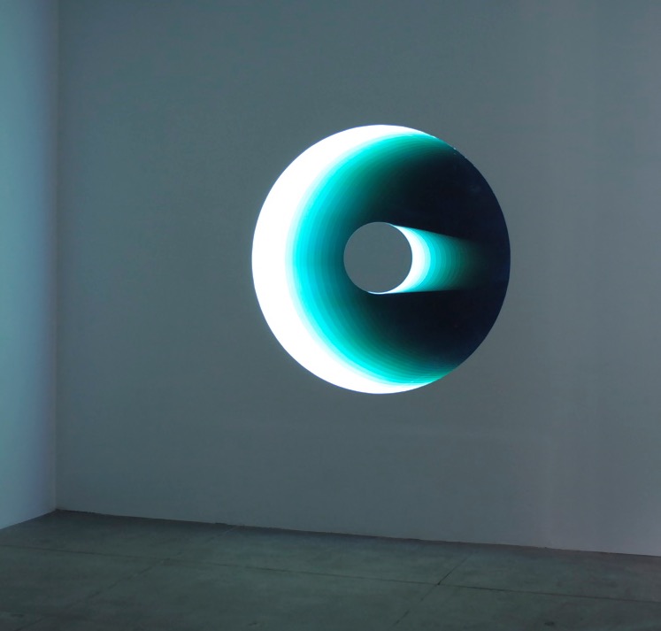
It's an infinity mirror.  An artwork made of a two-way Mirror, ordinary mirror, wood and LED Lights.  It's part of a series that explores astronomical telescopes (and their mirrors) - such as the Hubble Telescope.

How is it made?
Infinity mirrors are something many of us discovered in a bathroom as children by accident when a small mirror reflected a larger one. We craned our heads to catch a glimpse of the darkening tunnel of repeated images, frustrated by the physics that keep most of you out of view.  Oh that, and it was in most 80s pop videos.

An infinity mirror is fairly simple to make, and it's common to add LED lights to accentuate the tunneling effect.

Instructions from Make Zine


Instructions from Make Zine

Adam Belt has used the same effect in other pieces, such as the Hubble Telescope mirror.

Why did I pin this?
This whole series (including the related series "Down the Rabbit Hole" which explores the theme of particle colliders) is a wonderful blend of conceptual, practical effect and aesthetics.  Belt has achieved real subtly and depth in the work.  Gentle gradients of color, and precise shapes overcome the awkward lighting artifacts of the normal infinity mirror.  

DSC_0522_2000.jpg

The forms are simple, and feel almost reverential, as if they belong in some future cathedral for quiet mathematicians. Different geometries are revealed as the viewpoint changes - from blended waves of color to hairline shapes - the piece expands and contracts in its' own complexity.

What did I learn?
Simple techniques can yield such subtle results. Inspiring also in the color blends from a pure visual design perspective, as well.

#2 - Extruded brass chisels by Emilie F. Grenier by Charlie Sutton

EmilieGrenier_DisquietLuxurians_005_highres-600x850.jpg

WHAT IS IT & WHO MADE IT?
An extruded brass chisel by Emilie F. Grenier, as part of a larger work examining "alternative trends for the production and consumption of rare and luxurious objects" .


HOW WAS IT MADE?
I'm not sure precisely how Emilie fabricated  her pieces, but brass extrusion is a fairly mature process - locks, hinges, bullet casings, bathroom fixtures can all use that process. I imagine the advantage for someone doing short production runs like this, is avoiding the cost of making moulds, and that the finish can be high quality from process itself.

Whatever the case - similar simple brass forms seem to be appearing everywhere.  We were fortunate to be given this Hex Opener by Iacoli &McAllister as a housewarming present recently. The density and feel in the hand are seductive.

 WHY DO I PIN IT?
Emilie's own description is an interesting brief, and the history of expensive paper-weights and such, bears out a thesis that there is a place for luxury simple objects. Of course, that artistic brief of "designing for the 1% without going to hell" is (ahem) maybe a whole discussion on it's own.

For me - there's something about the primitiveness. It feels like a tool that inserts itself into a greater machine, the final key to some complex industry.  As an object, it captures a wide span of time.  Both immediately seeming pre-Victorian and yet also able to last for longer than I do.  

WHAT DID I LEARN?
I geeked out a little on Brass extrusion clips - but most of all it was one of those moments where I connected something precious in my life with a pin, and the history of the object pinned made me consider why I liked that little Hex opener so much.

#1 - Pod chair by Benjamin Hubert by Charlie Sutton

WHAT IS IT & WHO MADE IT?
It's a chair. More specifically - an "acoustic privacy chair" by Benjamin Hubert for De Vorm.

De Vorm are a furniture company from The Netherlands. They seem to have genuine focus on the environmental impact of their materials and process, without any apparent compromise to the desirability of their product.  If anything, that commitment seems to inform a classic kind of minimalism, albeit with a soft edge.

HOW WAS IT MADE?
Fortunately, there is a short film documenting the process of manufacturer, posted by Hubert himself. It's without too much polish - which is good.  Seeing the felt blanket used during the vacuum press and other realities of production - for me, is better than earnestly produced videos of people in thick denim aprons.  

Moreover - it is always a good sign when furniture designers make their technical drawings available, and De Vorm go a step further with full CAD files.  

WHY DO I PIN IT?
I remember trying an acoustic privacy chair at Cork Airport many years ago - and the ability of furniture to create a sonic space has always interested me.

WHAT DID I LEARN?
I came away with with an appreciation of De Vorm as a company, and they are on my watch list for personal buys.